Rapido Safety
Overview
At Rapido, safety is non-negotiable. With 40+ millions rides each day, every decision affects real people and real outcomes.
In this project, we treated safety as a system embedding safeguards, signals, and support at every stage of the rider journey. From booking to drop-off, we aimed for safety that’s built-in and always on.
This case study shares how we navigated tradeoffs, scaled trust, and made safety a seamless part of every ride.

My Role
Product design,
UX research,
Prototyping,
Usability testing
Team
Product Designer - Me,
PM- Saurabh,
Research - Caren, Consumer Service Delivery team, Developer - 5 people
Timeline
6 months,
March-August 2023
Tools
Figma, Miro
A Crisis That Redefined Our Approach to Safety
Safety is often treated like a checklist—until reality forces a different perspective.
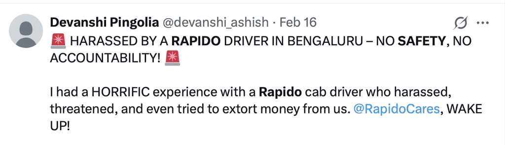
In November 2022 and early 2023, Rapido faced a critical moment. Two horrific sexual assault incidents involving Rapido rides led to intense public outrage and deeply shook trust in our platform. It made one thing painfully clear: without safety, nothing else we built mattered.
We couldn't afford surface-level solutions. Trust isn't restored through one feature or campaign—it’s rebuilt through every small interaction, visible and invisible.
With this in mind, we redefined our approach. Instead of asking "What safety features should we add?", we asked a harder question:
"How do we design for trust at every touchpoint?"


The Voices We Couldn’t Ignore
Screenshots of user reports and public articles about safety concerns, shown unedited.


The Problem We Couldn’t See
When we dug into the data, the truth was harder than expected.
Every month, over 1,000 safety-related incidents were reported on Rapido—including 250+ cases of sexual harassment. These reports came through channels like in-app chat support and post-ride ratings. But that wasn’t the whole picture. Our contact ratio—users who reached out versus total riders—was less than 0.5%. For context, industry benchmarks at the time showed contact rates closer to 3%.
We weren’t just missing reports.
We were missing the scale of the problem itself.
How many riders never spoke up?
How many brushed off unsafe moments as “normal”?
How many quietly stopped trusting us—without saying a word?
It wasn’t enough to fix what was visible.
We had to design for the invisible fears, the silent discomforts, the everyday risks that users carried without ever reporting them.
So we split our approach into two tracks:
→ One to address urgent gaps right away.
→ Another to build an end-to-end safety system for the long term.

Understanding Safety Through Our Users
We couldn’t assume what safety meant to our riders—or how they experienced it.
We partnered with our Research team to explore key questions around how users perceive safety, what makes them feel unsafe, and how they respond in those moments.
We interviewed 15+ Rapido riders across diverse demographics—split across bike and auto users—knowing that physical proximity, exposure, and perceived risk differed between these services.
A woman riding solo on a bike, a parent using an auto with a child, a student commuting daily—each carried different expectations, fears, and coping strategies
We also explored a key distinction:
→ Did users think of “safety” and “emergency” as the same? Or as different moments needing different responses?
This research helped us map not just their answers—but their triggers, thresholds, and behaviors.
What We Learned from Our Users
I always double-check the captain’s face and vehicle number in the app—especially early mornings when I’m traveling alone with my kid. I can't afford to take risks.
~ Mother, Bangalore
"
I always ask the captain to drop me a bit away from my house. I don't feel comfortable letting him know exactly where I live.
~Female Rider, Kolkata
"
The captain asked me to pay through Google Pay, and later he started texting me on that number. I never expected sharing my payment details could lead to this.
~ Female Ride, Bangalore
"
Brainstorming

What Our Users Reported
User interviews gave us their fears and perceptions. But we also wanted to know what they were reporting in real life. Every day, our Customer Support team fields hundreds of safety-related issues—giving us a clear window into real incidents, patterns, and gaps.
Safety Report Categories
The support team organizes safety issues into three broad categories:
Critical Incidents
Operational Safety Issues
Non-Critical Complaints
Sexual comments
Physical touch/groping
Asking for physical favour
Stalking
Following them home
Snatching
Physical violence
Inappropriate comments (threatening/sexual)
Staring improperly via mirror (threatening/sexual)
Stopped in between
Took a different route
Different vehicle arrived
Different captain arrived
No helmet provided
Demanding extra cash
Issue with payment
Captain was drunk
Rash driving
Rude behaviour
Abusive to customer
Abusive to others on the road
Poor hygiene
Bad vehicle condition
Inappropriate comments (if non-threatening tone)
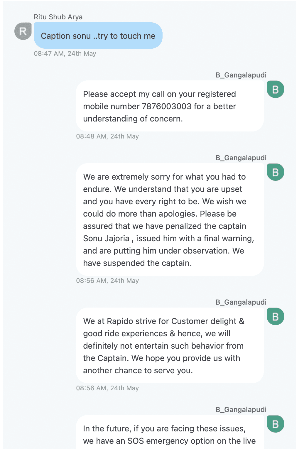
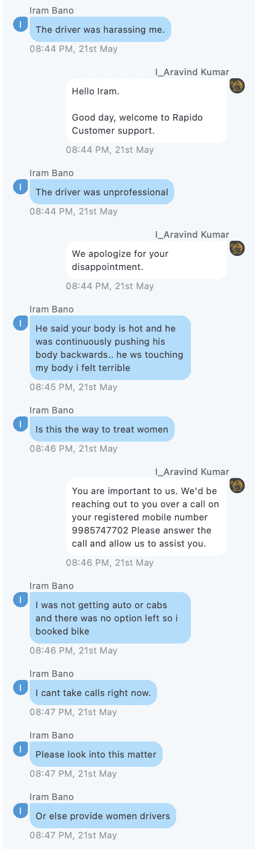
A Look Inside Real Reports
We read hundreds of support chats to hear how users described fear and discomfort in their own words.
“he is asking each and everything of my personals and asking me to come for date”
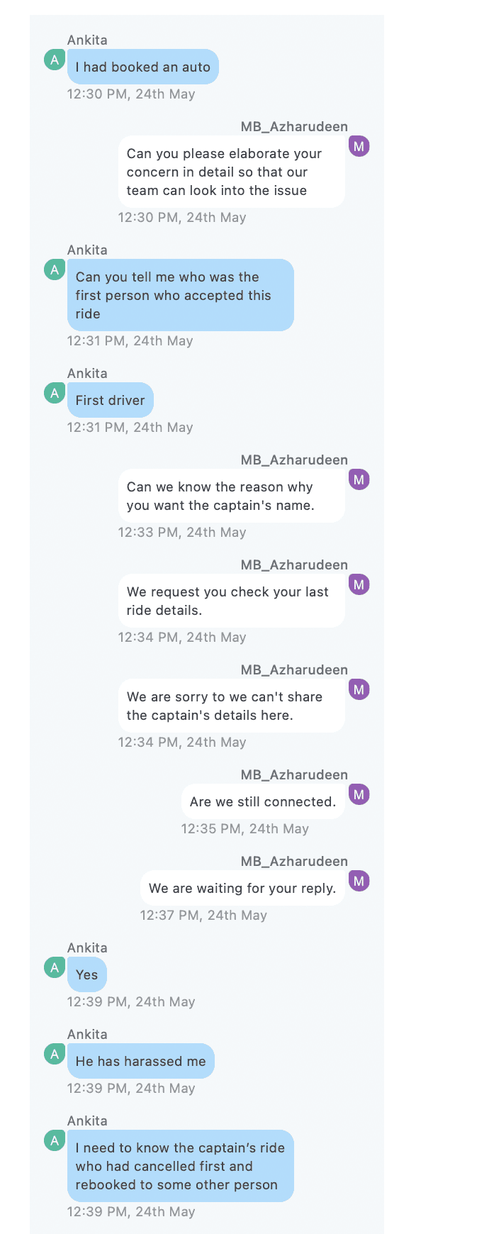
“Can you tell me who was the first person accepted this, he has harassed me ”

“He said your body is hot and he was continuously pushing his body backwards.. ”

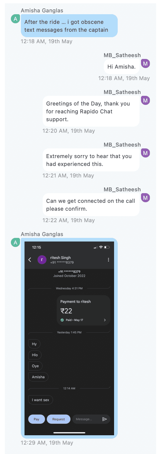

“After the ride…I got obscene text messages from captain ”
“Captain was trying to hold my hand and tried to take me with him ”
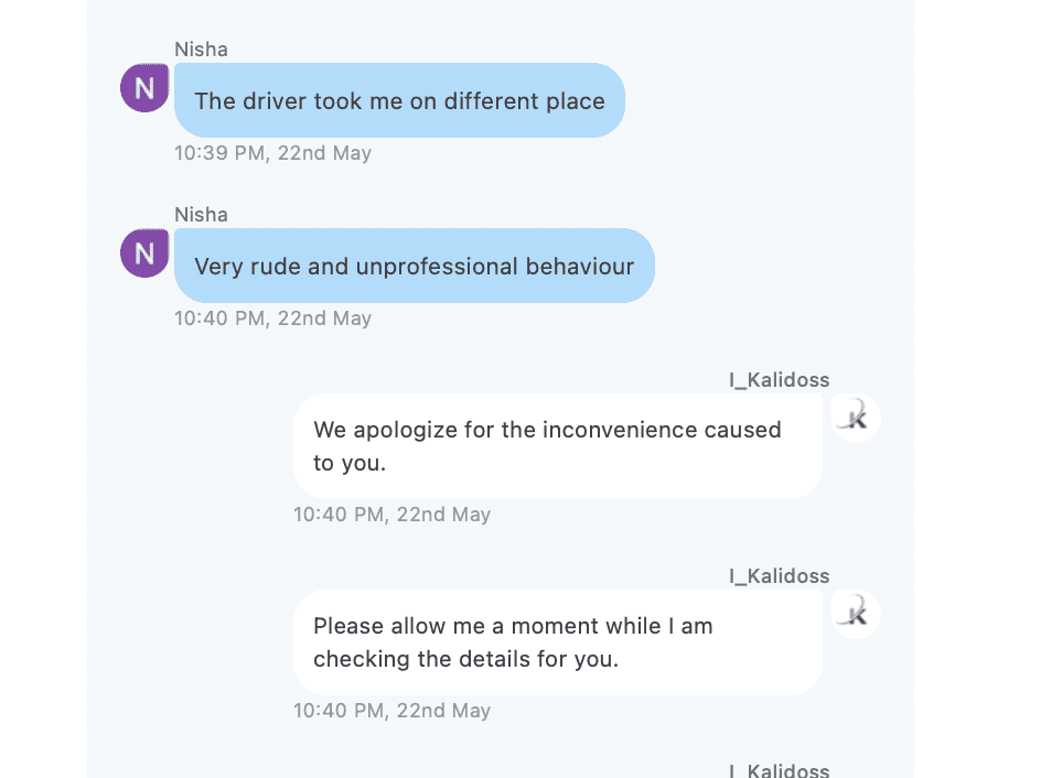

“Driver took me to a different location ”
“Driver stopped the ride in middle of the road and stared driving me to somewhere else ”
“I shouted on him to stop and jumped from the vehicle ”

“Because of rapido coin my fare was 6 rs. but the captain misbehaved … ”
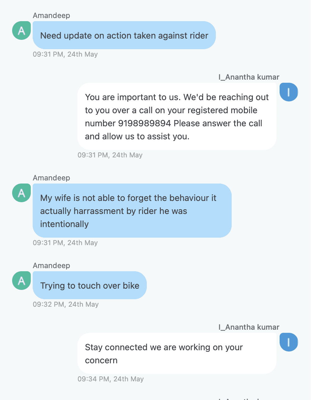
Stepping Into the Support Role
We read hundreds of support chats to hear how users described fear and discomfort in their own words.I worked alongside the Customer Support team—reading, tagging, and responding to safety reports in real time.
What stood out: the categories didn’t always match how serious the incident felt. Some riders under-reported—saying that writing down the whole story felt like too much effort. Others shared in interviews that they didn’t escalate because reporting felt unclear or not worth it.
Many reports blurred categories—small issues sometimes snowballed into critical incidents.
Where We Were Falling Short
Talking to users, reading support reports, and auditing our product revealed one thing: safety wasn’t failing in a single moment—it was breaking across the journey. What they told us, and what they didn’t say, pointed to gaps at every step.
Users defaulted to WhatsApp to share location—many didn’t know we already had this feature.
→
We weren’t surfacing safety tools where and when they were needed.
Most users didn’t know the safety button existed after booking.
→
Critical safety actions were buried in non-discoverable places.
No one remembered—or understood—what trusted contacts were, or how to add them.
→
Proactive safety tools lacked visibility and clear purpose
Some users shared live location with captains on WhatsApp, exposing their phone numbers.
→
Insecure workarounds filled gaps in our product experience.
Payment confusion—especially with Rapido coins—often escalated into conflict.
→
Captains didn’t understand the system, and operational gaps turned small disputes into safety risks.
Typing out the full story felt overwhelming—especially in moments of stress.
→
Users wanted a human touch, not a chat. Our tools weren’t built for urgency or emotional clarity.
Many users wanted to report issues during the ride—but once it ended, they let it go.
→
Frustration faded, but gaps stayed. We were losing signals that could have shaped safer experiences.
Users couldn’t report captain issues if the ride was cancelled.
→
Reporting was tied to completed rides, leaving gaps for unresolved incidents.
Auditing the Current Experience

On-Ride Safety Flows
Ride assigned
Safety button flow
Emergency call
Share Location
"Safety button went unnoticed after booking."
"Users searched for Share Location—they didn’t know we had it."
Off-Ride Safety Access Points
Reporting from My Rides
Reporting from Menu
Home to Menu
Adding Trusted contacts from profile
"Trusted Contacts were buried-few ever reached them."
"Most didn’t know issues could be reported post-ride."
"Even trained users missed Share Location in the flow."
"Trusted Contacts were never discovered or used."
"Reporting felt too effortful—users looked for a human, not a chat."

"Live location shared via WhatsApp—exposed phone numbers."
"Support flow lacked clear direction for safety concerns."
"Cancelled rides left no way to report issues."
"If users couldn’t act mid-ride, they often let it go."
Awareness Issues
Key safety tools existed but users didn’t know where to find them.
Guidance Issues
Even when visible, flows weren’t understood or timed well.
Emergency
Issues
Users couldn’t act quickly or effectively in critical moments.
How It Felt for Riders

Where We Saw Opportunity
Our audit didn’t just reveal what was broken—it showed us where design could step in.
We saw three clear themes emerge:
Proactive Opportunities
Reactive Opportunities
→
Put the right tools in the right place—before users have to look.
Make Safety Visible
→
Set expectations early so action doesn’t rely on instinct.
Guide Before the Panic
→
In high-stress moments, every second counts. Make the next step obvious—and human.
Design for Urgency

Building a Safer Ride Experience
“We didn’t just fix safety gaps—we redesigned the entire journey so safety felt integrated, intuitive, and human at every step.”
Core Principles We Followed
Safety must be visible—never hidden
Directly addresses your earlier insight about discoverability
Guidance beats guesswork
Reflects exactly your findings about unclear flows and guidance gaps.
Human, not robotic
Powerfully aligns with user emotional pain points during emergencies.
What Changed, Where—and Why

Safety banner on onboarding

Safety toolkit card on Home (ingress)

Dedicated safety section in menu

Safety Page
AWARENESS
Set safety expectations from day one—trust starts early.
AWARENESS
Surface critical tools where users start, not where they dig.
AWARENESS
One roof for everything safety—no scattered access points.

Captain search – contextual safety banner
AWARENESS
Build readiness before the ride even begins.
Safety and share location button upfront with explicit label

GUIDANCE
Encourage sharing early—before it’s needed.
GUIDANCE
Labels matter—users shouldn’t guess where help lives.


Redesigned ride-started safety flow
Emergency flow
Redesigned share location flow
Call masking
Awareness banners inside chat
In-app live location sharing


Auto-triggered safety check
On-ride reporting
Help touchpoint after every ride
GUIDANCE
Clarified what users can do mid-ride—without needing to pause and think.
EMERGENCY
In a crisis, response should be one tap—not a maze.
GUIDANCE
Made sharing easier and broader—users can now add trusted contacts or send a link.
AWARENESS
Keep user contact private, build silent trust into every ride.
AWARENESS
Remind users of tools—even inside active conversations.
GUIDANCE
Avoid unsafe workarounds like WhatsApp—keep it in-platform.
EMERGENCY
Proactively detect risk—don’t wait for users to raise the alarm.
EMERGENCY
Let users flag issues mid-ride—without delay or risk.
GUIDANCE
Reporting shouldn’t require digging—place help right at the exit.
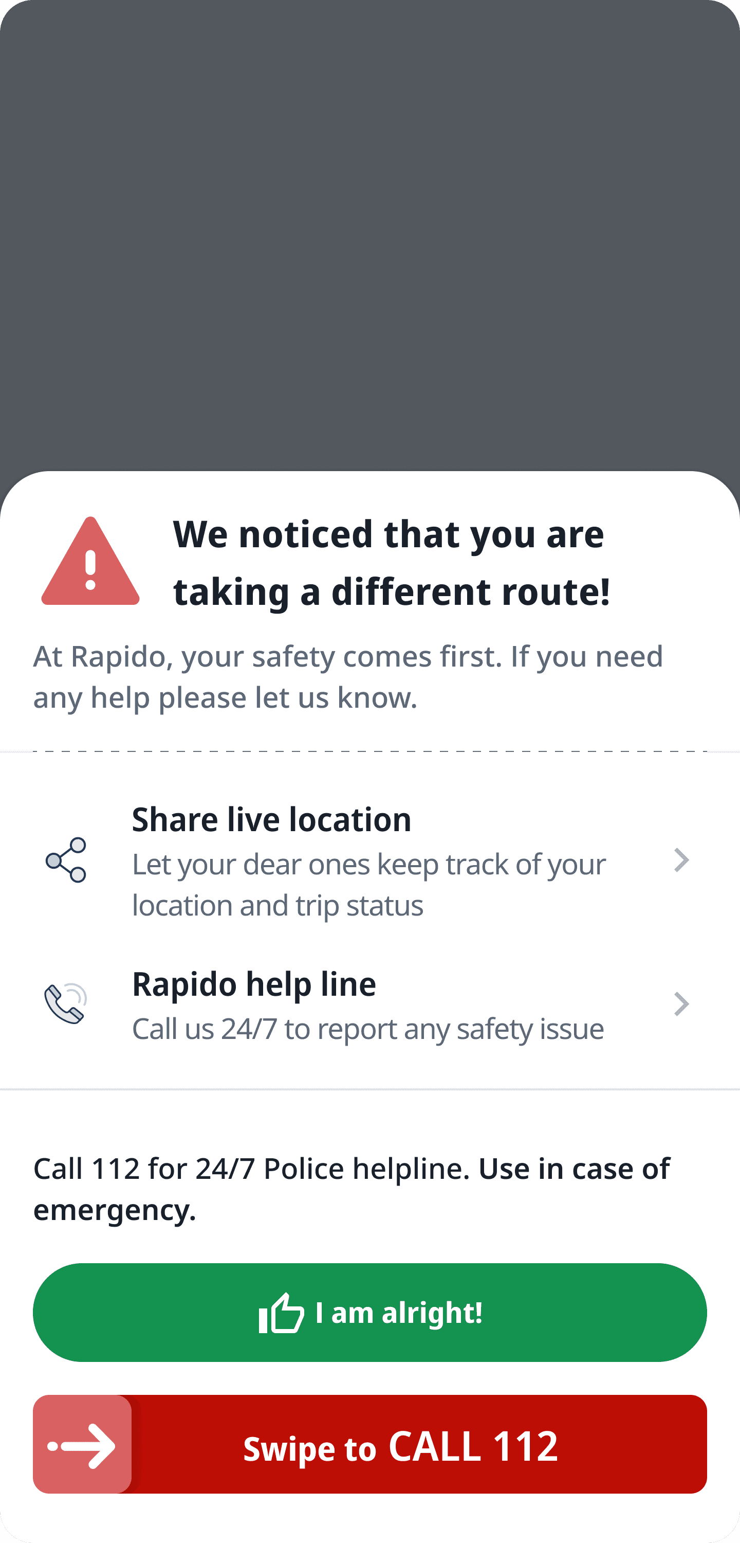
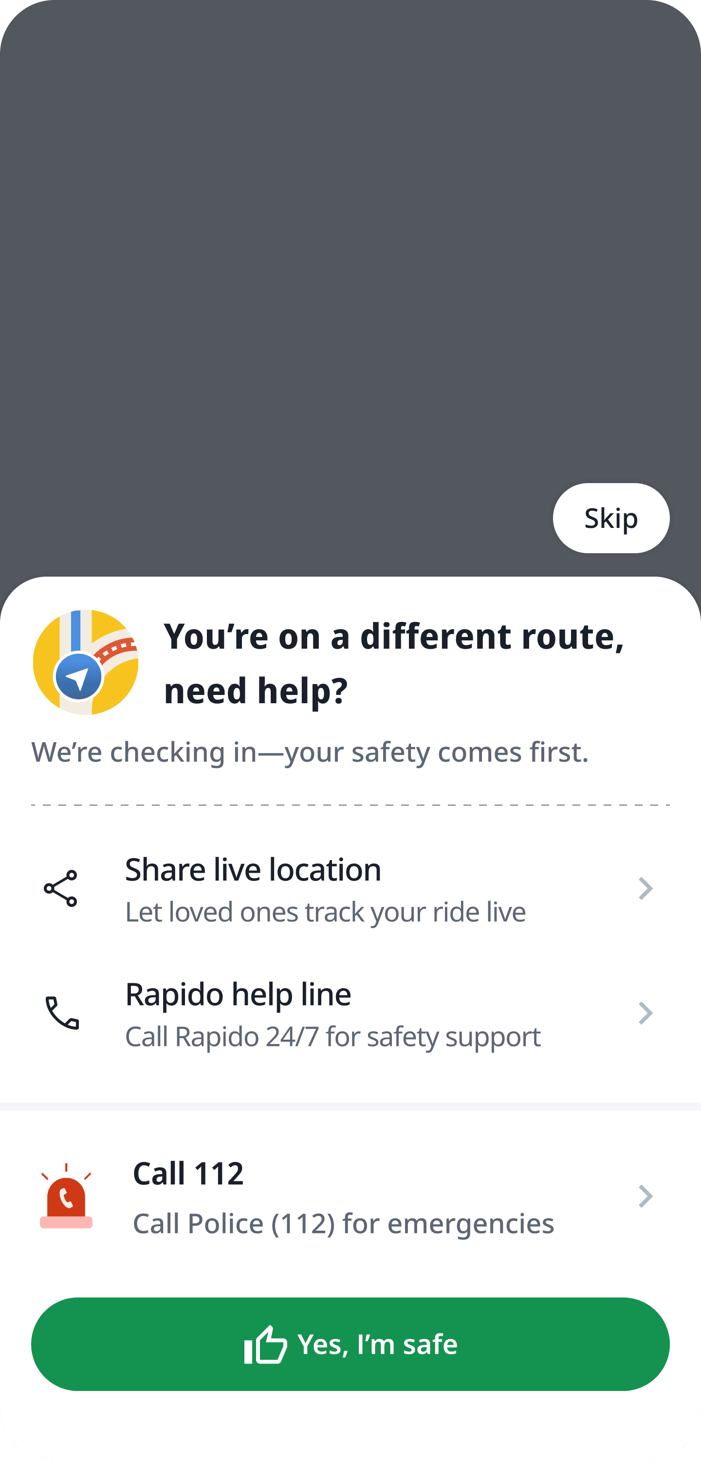
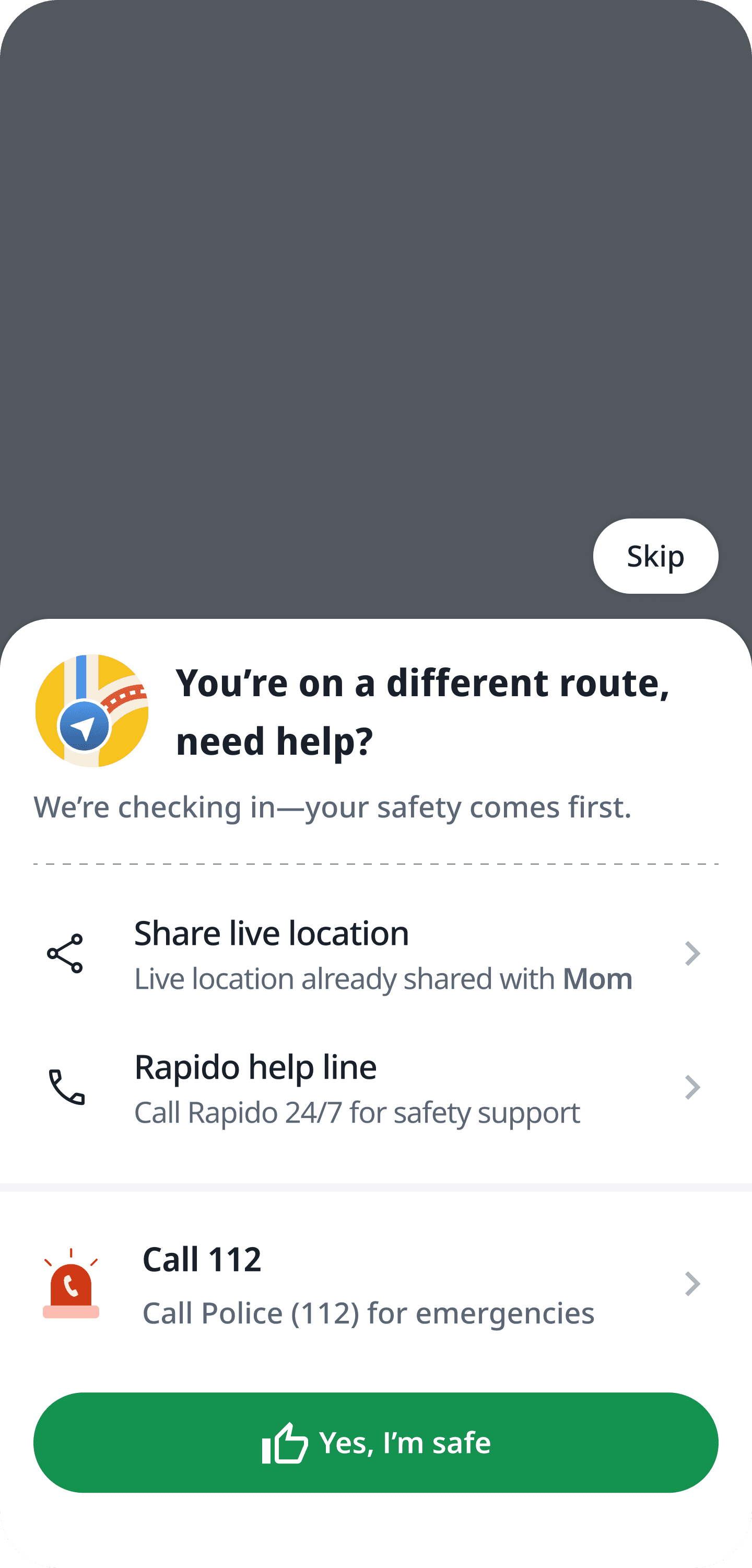
Auto-Triggered Safety Check


Variations
First version: Too alarming—users panicked
Refined: Softer tone, clear reassurance
Proposed: Show if location already shared (not shipped)
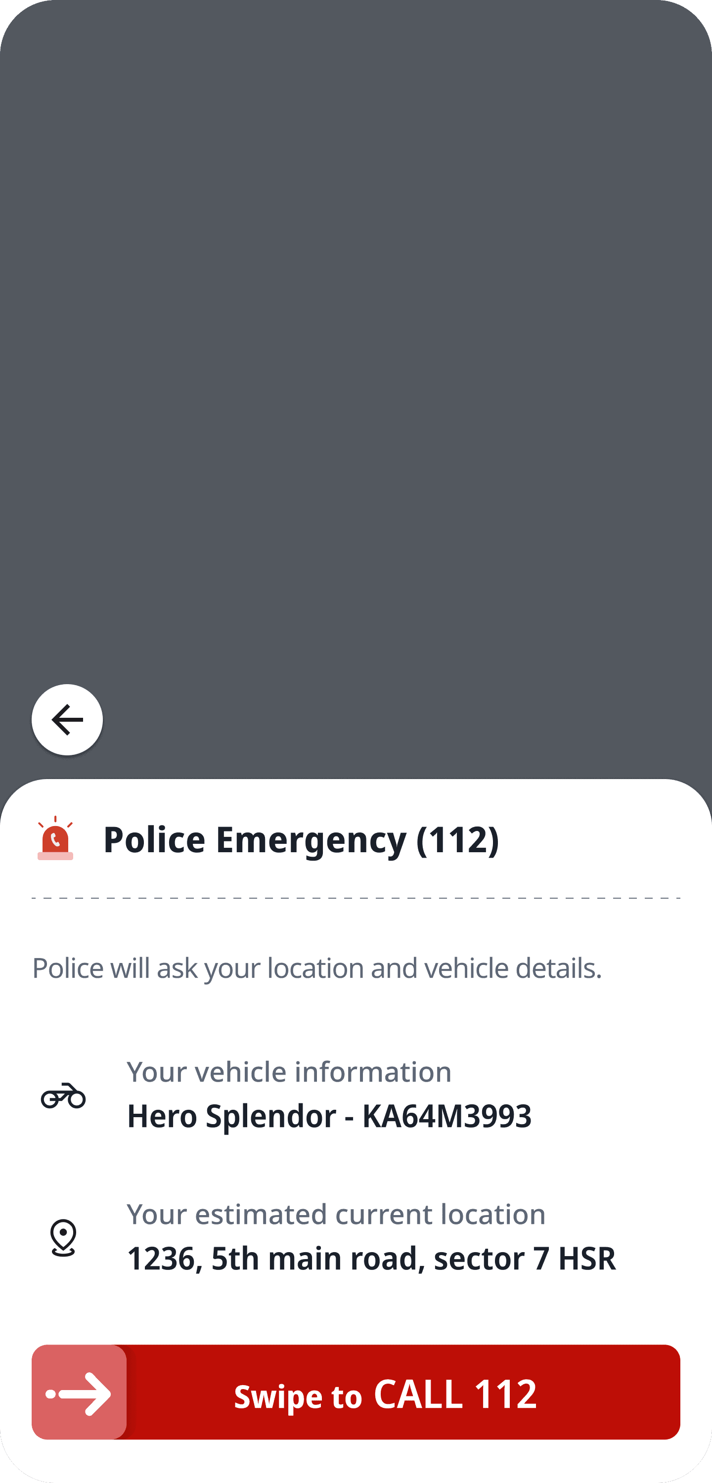
Auto-fill for police: Location + vehicle details
Emergency alert sent to police + nearby captains
Emergency alert