How We Built Vespa, Rapidos Design System

How We Built Vespa, Rapidos Design System

To support Rapido’s scale, speed, and user experience, we built Vespa—our design system for 3.7M+ daily rides.
What began as a component library became a foundation for accessibility, consistency, and rapid development.

To support Rapido’s scale, speed, and user experience, we built Vespa—our design system for 3.7M+ daily rides.
What began as a component library became a foundation for accessibility, consistency, and rapid development.

60+ UI Components

1-week sprint execution

5x ride growth in 2 years

12+ services launched in 2 years

Dev time reduced from 45 to 14 days

Dev time reduced from 45 to 14 days

60+ UI Components

1-week sprint execution

1-week sprint execution

1-week sprint execution

My Role

My Role

My Role

System design, Usability testing

  • Core contributor to the component library

  • led the development of the design system

System design, Usability testing

  • Core contributor to the component library

  • led the development of the design system

System design, Usability testing

  • Core contributor to the component library

  • led the development of the design system

Team

Team

Product Designers - Me,Jai & Sid Dedicated system developers, Product Manager - Praneeth

Product Designers - Me,Jai & Sid Dedicated system developers, Product Manager - Praneeth

Timeline

Timeline

Timeline

Oct'22 - Feb'23 (Component library)

Feb - May 2024 (Design system)


Oct'22 - Feb'23 (Component library)

Feb - May 2024 (Design system)


Oct'22 - Feb'23 (Component library)

Feb - May 2024 (Design system)


Tools

Tools

Figma - create components & variables

Token studio - Tokenization

Figma - create components & variables

Token studio - Tokenization

Development Was Lagging, Design Was Scattered, and UX Took a Hit

Rapido’s old app (V7) was outdated and unscalable, making even small changes painfully slow—on average, a minor feature took 45 days to build.


The design lacked consistency. Each screen felt like a separate app, with inconsistent use of our primary brand colour, yellow. With no documentation or Figma file, designers had to rely on app screenshots and rebuild components from scratch.


Beyond visuals, the cluttered screen hierarchy hurt the user experience. The result? Slower development cycles, fragmented design, and a pace of growth that couldn’t keep up with business needs.

Laying the Foundation

We started by mapping the entire app—listing every flow, use case, edge case, common component, and state. The initial plan was simple: build a UI kit first.


To understand visual trends, we explored UI8, Dribbble, and Figma for inspiration. Given our tight timeline and team bandwidth, we considered buying a UI kit and customizing it for Rapido.

But that decision quickly backfired.

Why a Pre-Made UI Kit Didnt Work

  • Without Established Brand Guidelines – Everyone had a very different vision of how Rapido should look, leading to constant feedback loops and misalignment.

  • Customisation Wasn’t Scalable – UI kits are generic, and adapting them for Rapido’s use cases was taking just as much time as building from scratch.

  • Accessibility took a backseat—many colours weren’t WCAG-compliant, making inclusive design a challenge

Meanwhile, we put all design improvements for V7 on hold to stay on track with the V8 timeline. That meant revisiting our plan.


We studied multiple design systems—Airbnb, Material, and Uber Base. Two clear models stood out: a top-down, layered approach and a bottom-up, atomic design model. To unblock development faster, we chose atomic design, breaking it down into milestones for a structured rollout.

🌋 Revamping Post-Order Was the Tipping Point

In 2022, when I joined Rapido, my first project was to revamp the Post-Order flow (after a captain is assigned) to improve the user experience. But the required development time and architectural changes were so massive that we couldn’t move forward.


That’s when we realised—we couldn’t keep working this way. To move faster and stay competitive, we needed a scalable structure that didn’t compromise on user experience.

Figuring out how to make this shift wasn’t easy. It meant bringing together stakeholders from across the organisation for deep discussions on what had to change.

Incremental Fixes or a Full Rebuild?

After multiple discussions with Product, Design, Engineering, Business teams, and our founders, we were torn between two approaches:

  • Redesign and rewrite each flow of the V7 app incrementally, one at a time.

  • Build a new app (V8) from scratch, redesigning and rewriting everything in one go.


Surprisingly, the engineering team estimated that building a new app would take less effort than fixing the old one piece by piece. That sealed the decision—we committed to V8, targeting a launch within a year.


dedicated team of designers, engineers, PMs, QA, and data analysts came together, with our co-founder Rishi leading the initiative.

Development Was Lagging, Design Was Scattered, and UX Took a Hit

Rapido’s old app (V7) was outdated and unscalable—small features took 45 days to build.
Design was inconsistent, screens felt disconnected, and our brand color lacked uniformity.
Without documentation, designers rebuilt components from scratch, slowing everything down.
Cluttered screens hurt user experience, and growth couldn't keep up with business needs.

🌋 Revamping Post-Order Was the Tipping Point

n 2022, when I joined Rapido, my first project was to revamp the Post-Order flow.
But the development time and architectural challenges were too massive to move forward.


That’s when we realised—we needed a scalable structure that wouldn’t compromise user experience.
It took deep discussions across teams to figure out how to make that shift.

Incremental Fixes or a Full Rebuild?

After discussions across Product, Design, Engineering, Business, and our founders, we faced two choices:
Fix V7 flow by flow, or build a new app (V8) from scratch.


Engineering estimated building V8 would take less effort—so we committed. A dedicated team came together, led by our co-founder, targeting launch within a year.

Laying the Foundation

We started by mapping the entire app—every flow, use case, and component. The initial plan was simple: build a UI kit. To save time, we considered buying and customizing a ready-made kit. But that decision quickly backfired.

Why a Pre-Made UI Kit Didnt Work

  • No brand guidelines—everyone had a different vision how Rapido should look like.

  • Customization wasn’t scalable—fixing the kit took as long as building from scratch.

  • Accessibility suffered—many colours weren’t WCAG-compliant.

We paused V7 improvements to focus fully on V8.


After studying Airbnb, Material, and Uber Base, two models stood out:

  • Top-down, layered approach

  • Bottom-up, atomic design

To unblock development faster, we chose atomic design and structured it into milestones.

M1

M3

M3

Creating atoms & Molecules

Creating atoms & Molecules

  • Colours, Typography

  • Spacing, Grid & Layout

  • Components, Icons, Elevation

  • Tokenization

  • Colours, Typography

  • Spacing, Grid & Layout

  • Components, Icons, Elevation

  • Tokenization

M1

M1

Building Organism & Templates

Building Organism & Templates

  • Structuring key sections

  • Defining happy flows

  • Covering main use cases

  • Structuring key sections

  • Defining happy flows

  • Covering main use cases

Crafting Pages

Crafting Pages

  • Setting the visual style

  • Defining principles & documentation

  • Setting the visual style

  • Defining principles & documentation

M2

M2

Core Principles

Core Principles

Intutive

Intutive

Scalable

Scalable

Accessible

Accessible

Creating atoms

Atoms are the smallest building blocksthings like buttons, icons, colors, and typography. Theyre the foundation for everything else in the system.

Colour Palette

Typography

Noto Sans

Aa

50

100

200

300

400

500

600

700

800

900

50

100

200

300

400

500

600

700

50

100

200

300

400

500

600

700

50

100

200

300

400

500

600

700

50

100

200

300

400

500

600

700

50

100

200

300

400

500

600

700

50

100

200

300

400

500

600

700

50

100

200

300

400

500

600

700

50

100

200

300

400

500

600

700

Gray

Blue

Green

Pink

Orange

Teal

Red

Purple

Yellow

We moved from Product Sans to Noto Sans for its open-source flexibility and support for multiple native languages.

We built a color set for all use cases, knowing we'd refine it as our visual style evolved. Tested for accessibility with Able.

Tags

Icons

Separator

Line

Dash-line

Elevation

We temporarily used Material Icons to unblock development, planning to introduce a custom icon set once the visual language was finalised.

Spacing

Chips

Buttons

Elevation / 0

Elevation / 1

Elevation / 2

Horizontal spacing

Horizontal spacer

1x = 4px

Columns

Grid & Layout

Rows

Colour.gray.900

#1A202A

Colour.green.500

#13934F

Colour Tokens

Tokenizing the Building Blocks

We tokenized atoms first to ensure scalability and reduce repetition before building molecules. This covered typography, spacing, elevation, and border radius

Typography

title/extra-large/emphasis

{
"typography": {
"title": {
"extra-large": {
"emphasis": {
"font-family": "Noto Sans",
"font-size": "22px",
"font-weight": "700",
"line-height": "28px",
"letter-spacing": "0.4px"

We used Token Studio to define and manage our design tokens

Forming Molecules

Molecules are groups of atoms working together as functional unitslike an input field with a label and button.

List

Compact

Moderate

Chevron

Check-box

Radio Buttons

Toggle

Icon

Pill button

Kebab

Text Input

Open

Contained

Enable

Positive

Error

Disabled

Info Banner

Neutral

Warning

Danger

Positive

Variant 2

Variant 3

Tooltip

Widegets

Refer and earn Rs.50 today

Bike

Dismissible Down

Dismissible Up

Dismissible middle

Non-Dismissible

With icon

Card

Rating card

Feedback card

Captain card

Captain search card

Ad card

Navigation

Default-solid

With loader

On scroll

Transparent

Dismissible

Icon Button

Pill button

Building Organisms

Organisms bring atoms and molecules together into functional sections, like a navbar or a product card.

Menu

Service Fare

Ride card

Safety bottom sheet

Service Fare

Confirmation bottom sheet

Structuring Templates

Templates define page structure, arranging organisms into cohesive layouts.

Address search

Confirmation location

Post assigned

Coupon page

By the time we wrapped up M2 in January, we were racing against the clock. We had to make a tough calldeprioritize visual design, guidelines, and documentation to launch an MVP. To move fast, we outsourced the visuals for the time being.

By the time we wrapped up M2 in January, we were racing against the clock. We had to make a tough calldeprioritize visual design, guidelines, and documentation to launch an MVP. To move fast, we outsourced the visuals for the time being.

Launching V8

Launching V8

  • Ran a 2-month internal test to spot design gaps and fix bugs.

  • Rolled out to 5% of V7 users with an upgrade option.

  • Gradually scaled to 100% of users.

  • Retired V7—V8 became the new Rapido.

  • Ran a 2-month internal test to spot design gaps and fix bugs.

  • Rolled out to 5% of V7 users with an upgrade option.

  • Gradually scaled to 100% of users.

  • Retired V7—V8 became the new Rapido.

We had no idea how users would react to the new Rapido app.

With 7 lakh rides a day, the revamped UI and UX posed a steep learning curve for existing users.


For the next four months, we doubled down on user testing (100+ sessions), qualitative research, and feedback collection to bridge the gap

We had no idea how users would react to the new Rapido app.


With 7 lakh rides a day, the revamped UI and UX posed a steep learning curve for existing users.


For the next four months, we doubled down on user testing (100+ sessions), qualitative research, and feedback collection to bridge the gap

Our biggest concern?

Impact

Impact

50

%

50% faster build time with reusable components

Smoother design-to-dev handoffs with a structured component library

90

%

Design consistency by unifying UI elements

60

+

standardised UI components

50

%

50% faster build time with reusable components

Smoother design-to-dev handoffs with a structured component library

90

%

Design consistency by unifying UI elements

60

+

standardised UI components

One year later

One year later

We had built a component library, not a true design system. The gaps became clear in our daily workflow.

Without proper documentation, guidelines, and design principles, inconsistencies crept in. Designers created multiple variants, picked colors based on preference, and when dark mode rolled out, our framework wasn’t built for theming. This meant double the design work, slower handoffs, and growing inefficiencies.

From a Component Library to a Design System

From a Component Library to a Design System

Uncovering the Gaps

Uncovering the Gaps

I ran a workshop with designers and developers to pinpoint the biggest problem areas

I ran a workshop with designers and developers to pinpoint the biggest problem areas

Designers

Developers

"We need to design twice for dark mode"

"There is no colour token for dark mode, don’t know which colour to use"

"we have components but no guidelines"

"Finding components is tough, don’t know their names to search for"

"Too many color tokens, hard to find the right one"

"We need to create variants based on the project"

"Color tokens are missing in the handoff files"

"Too many random component variations, none are reusable"

"Dark mode designs are delayed, slowing down development"

"Dark mode colours are inconsistent"

"Same components are being used for different interactions"

Setting the Goals

  • Create a single source of truth with clear guidelines and documentation, making decision-making effortless.

  • Rework the token system for structure and efficiency.

  • Make the design system intuitive—so using it feels natural, not like a learning curve.

  • Build for scale, ensuring seamless theming and a well-defined visual language.

Why Investing in a Design System Made Sense

After the V8 launch, Rapido scaled 2x in just a year. With this rapid growth, inconsistencies started surfacing. At this point, we needed alignment—why fix these issues now? Why invest bandwidth in building a design system instead of focusing on new features and service launches?


From the start, we aimed for three things:


  • Speed

  • Better Experience

  • Consistency


But as we scaled, we got stuck in the middle. Collaboration slowed, and the development cycle suffered. After many discussions, we made the call—it was time to fix these issues, and I took the lead from the design side.

Restructuring the Token System

With a single-layer token structure, we had 9 colors with 8 shades each—75 color tokens.


  • Led to inconsistencies.

  • No usage guidance, turning the app into a Rangoli.

  • Made it difficult for designers to find the right token.


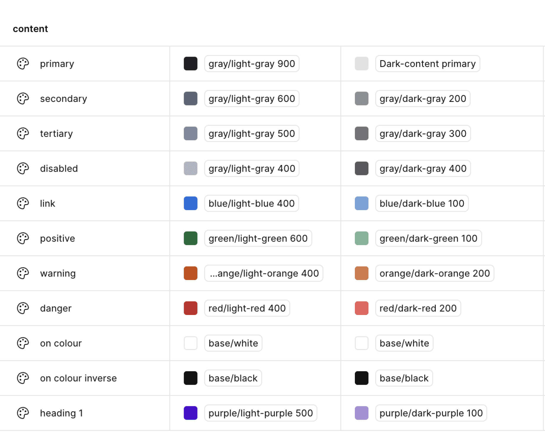
I structured the token system into two layers—primitive tokens derived from raw values and semantic tokens built on top of them for contextual use.

Designers worked only with semantic tokens, ensuring colors were chosen by guidelines, not personal preference.

Content.positive

Primitive token

Semantic token

You've saved ₹16 on this ride

#058743

Colour.gray.light_mode.500

#7AB496

Colour.gray.light_mode.500

You've saved ₹16 on this ride

Moving from Token Studio to Figma Variables & Styles

Limitations of Token Studio

  • Designers had to update each Figma file manually, with no notifications—leading to missed updates.

  • Developers had to export JSON and map it manually.

  • Dark mode tokens had to be applied separately.

  • Theming required an entirely separate set of tokens

Why Figma Variables Worked Better

  • New tokens could be created and applied instantly across all files.

  • Tokens were directly visible in dev mode, allowing developers to copy code-ready values.

  • Themes could be switched with a simple toggle.

  • A single token could support multiple themes, eliminating redundancy.

Dev mode

Primitive tokens

Semantic tokens

This toggle earned me chocolates and a Team Favorite badge!

Guidelines & Documentation

I set up a structured Figma file where each page details when to use a component, its behavior, and types. The guidelines are visual, making it easy for designers to make informed decisions while maintaining consistency across the app.

Visual design

We Collaborated with Liquid Ink to shape Rapido’s visual identity—patterns, illustrations, banners, icons, and spot illustrations.

To get everyone on the same page, we ran workshops with design, product, engineering, marketing, and business teams, aligning on a key question: 

Who are we?

Inclusive

Friendly

Energetic

Distinct

Relatable

Accessible

Captains

Spot Illustration

1


Illustration

Spot Illustration

Icons

Rapido's New Look

Impact on Rapido & Teams

Developers

  • Feature dev time cut from 45 days to 14 days

  • Smoother design-to-dev handoff

  • More maintainable & consistent codebase

Rapido

  • Better user experience

  • Consistency across the platform

  • Stronger brand identity

  • 5x growth in 2 years

Product

  • 12+ new services launched in 2 years

  • Faster experimentation cycles

  • 1-week sprint execution

Designers

  • Less effort in decision-making

  • More focus on design thinking than UI tweaks

  • Fun explorations with the new visual guide

What We Learned

A design system isn’t a one-and-done project—it evolves. Keeping it relevant means regular updates and maintenance. The real challenge? Striking the right balance. Too rigid, and it limits creativity. Too flexible, and inconsistencies creep in.


Building this system wasn’t a straight path. There was a lot of back and forth, taking inspiration from various sources. But figuring out what truly worked for Rapido took trial, error, and learning.


The biggest takeaway? A design system is only as strong as its adoption. If it’s not intuitive and valuable, teams won’t use it.

P.S. Why 'Vespa'? You’ll have to visit our office to find out!

Next project

Back to Work