
This case study explores how we experimented with city-based Popular Places recommendations with price ranges for new users at Rapido—helping turn intent into action. Building on these insights, we expanded smart recommendations to regular users, enabling one-tap ride booking for a faster, more seamless experience.
My Role
Product Design
Visual Design
Prototyping
Usability Testing
Team
Senior Product Designer - Me
Product Manager - Kasa
Developers - Ankit, Anmol
Timeline
Experiment
2 weeks, June 2024
Tools
Figma

High Drop-off: 29% of New Users Exit from the Home Screen
High Drop-off: 29% of
New Users Exit from the Home Screen
Rapido completes 3.6M+ rides daily, with 30% of users being first-time users (FTUs). However, after installation and onboarding, around 29% of new users drop off from the Home Screen, leading to a significant drop-off from the top funnel.
100%
New users completing onboarding
81%
Users opening the homescreen
58%
Users entering the drop address and proceeding to check the fare
Users have 2 ways to move forward with booking
Users have 2 ways to move forward with booking
Where are you going?
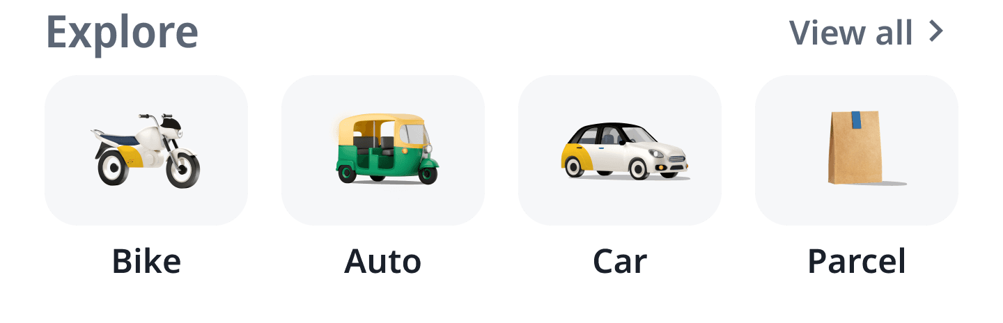
Manually searching for a location first
Select service first, then search location
Unlike regular users, we didn’t have any history for new users, so there were no personalized recommendations to simplify their search.
Unable to understand how to book a ride
Uncertain about Rapido's services
Unsure if Rapido is cheaper than their usual option
Potential Reasons
Potential Reasons
User behavior we observed
User behavior we observed
Just exploring the app
New users scroll and scan for familiarity
Users seek clarity before taking action
Users stay or leave within 30s–2mins based on first impressions
New users have a higher attention span than regular users
H1. The lack of recommendations increases effort and leaves users uncertain about their next step
H1. The lack of recommendations increases effort and leaves users uncertain about their next step
H2. Showing price ranges for common routes on the Home Screen can provide fare clarity and motivate users to proceed
H2. Showing price ranges for common routes on the Home Screen can provide fare clarity and motivate users to proceed
H3. Recommending popular city spots will grab attention, encourage exploratory behaviour, and increase in-app engagement
H3. Recommending popular city spots will grab attention, encourage exploratory behaviour, and increase in-app engagement
To validate these hypotheses, we planned run an A/B test showing popular place recommendations with price ranges on the Home Screen for new users.
To validate these hypotheses, we planned run an A/B test showing popular place recommendations with price ranges on the Home Screen for new users.
Metrics: 📉 Reducing drop off & ⏱️ Increase time spent
Flow Ideation
We experimented 3 card variants


Book Ride
Book Ride
Information details
Information details
Ingress point on the Home Screen
Ingress point on the Home Screen
Added visual to capture attention
Added visual to capture attention
Price range with distance to provide clarity on Rapido's pricing
Price range with distance to provide clarity on Rapido's pricing
Booking flow
Booking flow
On tap


With Real image
With Icon
With Brand logo
Relatibility
Use case driven
Familiarity
Save for later
Save for later
On tap


Final UI
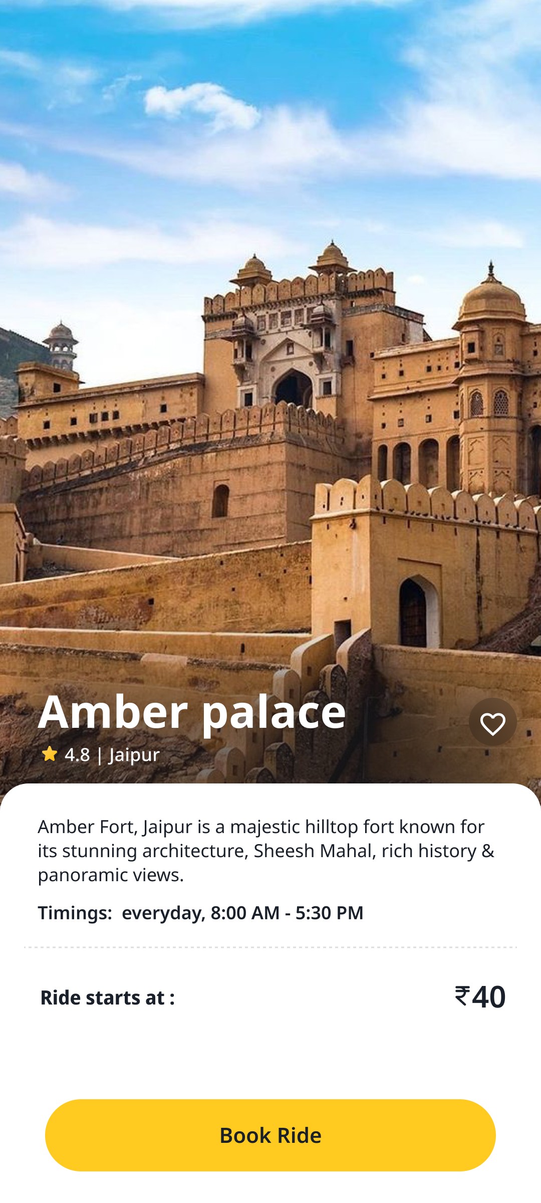
Added a city based splash screen for relevance, trust and delight


3% Growth in Ride Requests After Experiment
3% Growth in Ride Requests After Experiment
In the initial release, we ran an A/B test with first-time Android users, resulting in a 3% increase in ride requests from app open.
real images resonated more with users than icons.
Airports and Railway stations were the most-clicked, highlighting users' preference for functional, high-priority destinations.
We saw users returning to book rides to the same places, proving the impact of these suggestions.
Extending these learnings to Regular Users
Extending these learnings to Regular Users

We introduced recommendation widgets with real images for high-traffic locations like airports, bus stands, and railway stations for all users.
We introduced recommendation widgets with real images for high-traffic locations like airports, bus stands, and railway stations for all users.
Challenges We Faced in Scaling Real Images & Accurate Recommendations
Challenges We Faced in Scaling Real Images & Accurate Recommendations
Inconsistent image accuracy
Outdated images
Limitations in the backend recommendation algorithm
Inconsistent image accuracy
Outdated images
Limitations in the backend recommendation algorithm
Quick Book

Meet Ria
Meet Ria
Every day, Ria takes a Rapido to work and back home. Same locations, same service, around the same time. She already knows the price, yet she repeats the same steps, tap after tap. It works—but feels tedious and time-consuming.
Every day, Ria takes a Rapido to work and back home. Same locations, same service, around the same time. She already knows the price, yet she repeats the same steps, tap after tap. It works—but feels tedious and time-consuming.
Home
Home
Recommendation
Recommendation
Service selection
Service
selection
Pickup confirmation
Pickup
confirmation
Price setup
Price
setup
Request ride
Request
ride
Fewer taps, Faster rides
Reduce steps to minimise funnel drop-offs.
Build habit to make Rapido the preferred choice for ride requests
🤘🏽
Trust
Users have confidence in our pickup, drop, and service selection, booking effortlessly without needing to pay attention.
💪
🧠
Muscle memory
Keep placements consistent and design predictable, so users instinctively know where to tap—effortless, out of habit
Approach
Approach
Section heading
First Card
Position it in a prime spot on the home screen.
The first card should show the most relevant recommendation for that time and place.
Drop location, service, and price must be instantly clear.
Second Card
Keep two-thirds of the second card visible.
Left-align service and price for quick
Tested 4 variants with 20+ Users
Tested 4 variants with 20+ Users


Variant 1
Some users mistook it for a banner
Variant 2
Long addresses won’t fit this layout
Variant 3
Blended in with usual recommendations
Didn't notice the price
Variant 4
Most users understood the feature
Service, price, and location were clear
The "Quick Book" tag made it easy to grasp

Final flow
20% of Users Tapped ‘Quick Book,’ Driving a 4% Increase in Ride Requests
20% of Users Tapped ‘Quick Book,’ Driving a 4% Increase in Ride Requests
We're still tackling the challenge of suggesting the right location and service at the right time. To improve accuracy, we're refining the backend algorithm.
From Explore to Quick Book
From Explore to Quick Book


An experiment for new users
For all users
A feature for regular users

A song recommendation for you!
All illustrations are sketched with ❤️
Let’s build something meaningful—together
2025 Sayantika Dutta
Made with 🤍 and Coffee(Almond milk, no sugar)

Get in touch
Explore city with
Rapido


My Role
Product Design
Visual Design
Timeline
2 weeks, June, 2024
Meet Ria
A 27-year-old software engineer, recently moved to Jaipur for work. Excited but overwhelmed, she wants to explore the best food spots and shopping areas. After hearing about Rapido from colleagues, she downloaded the app to book rides for daily use.
Designing Beyond Point A to Point B
At Rapido, we identified an opportunity: first-time users, who make up 30% of our user base, tend to spend more time exploring the app’s home screen compared to returning users.
As a ride-hailing app, our core focus is getting users from Point A to Point B. However, we wanted to explore what more we could offer. With Explore City, we tested whether we could encourage users to spend more time on the app by suggesting popular places like food spots, shopping areas, or key landmarks nearby—fostering an exploratory habit along the way.


How we tested it
We explored two variants to see what resonated with users and tested in few cities for the initial release:
Real Images: Eye-catching visuals of places like sweets or shopping spots to grab attention and boost recall (e.g., "Best sweets in Jaipur").
Icons: Simple symbols like train or airport logos to meet immediate needs (e.g., "Nearby railway station").
Enhancements:
We proposed adding brand logos (e.g., Starbucks, Fabindia) to build trust and familiarity with recognisable names
What we faced
Limited Attention Span: Users primarily focus on booking rides from the home screen.
Goal-Oriented Usage: Most users already know their destination, making them less likely to engage with additional suggestions.
The results
In the initial release, 3% of users booked rides through the Explore City section - equivalent to over 80k+ rides daily. To scale this further, we are now focused on enhancing the recommendation algorithm.
Why it matters
As one of India’s largest ride-hailing platforms with 3M+ rides daily, Rapido aims to evolve into a multimodal platform catering to users’ end-to-end travel needs. This experiment provides valuable insights into user behaviour and helps us explore offerings beyond Point A to Point B ride bookings.
Hit play & Jaipur is just a song away!
All illustrations are sketched with ❤️